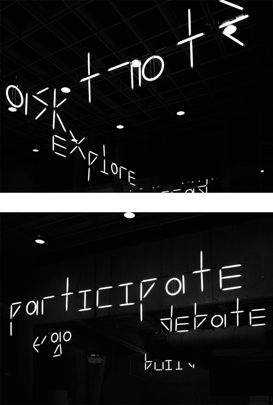
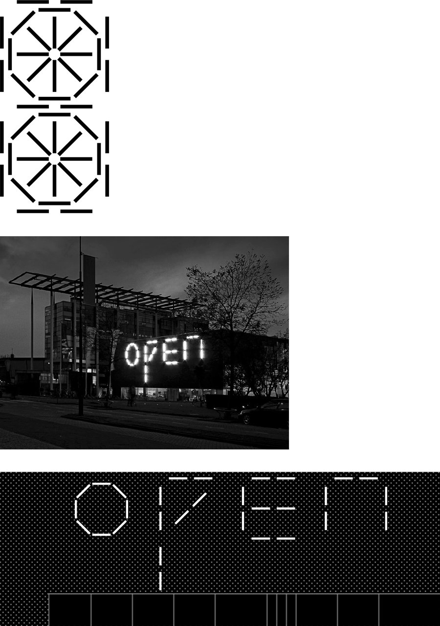
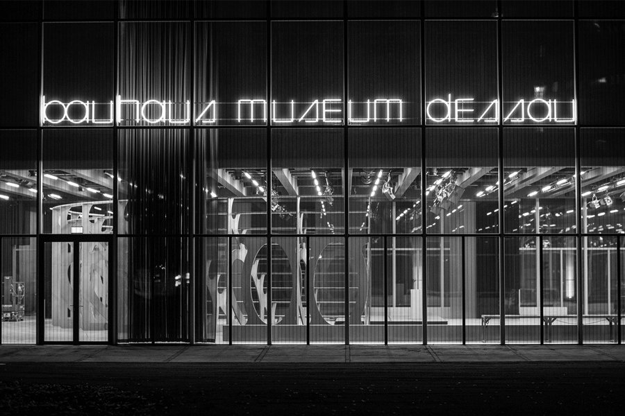
The basic proposition of Unit — a highly constrained modular typeface, arranged not only on the coordinates of an underlying grid, but also by the dimensions of its individual modular units — has been developed and applied in a number of contexts since 2009. The first of these was a commission, from the Dutch graphic design studio Mevis and Van Deursen (M&VD), to make a typeface whose letterforms could be displayed using large, industrial tube-lights, as part of their design for the 4th International Architecture Biennial Rotterdam. [1 2] The result — used prominently in the exhibition, and on the facade of its venue, the Netherlands Architecture Institute — was composed of two units: a circle; and a line that could be placed vertically, horizontally, or diagonally. [3 4]
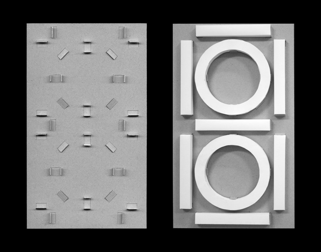
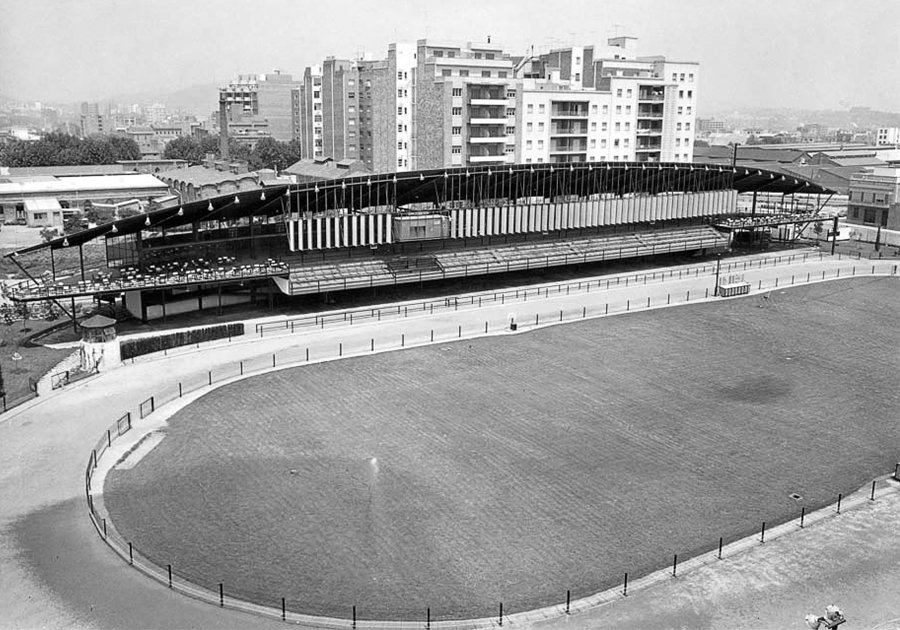
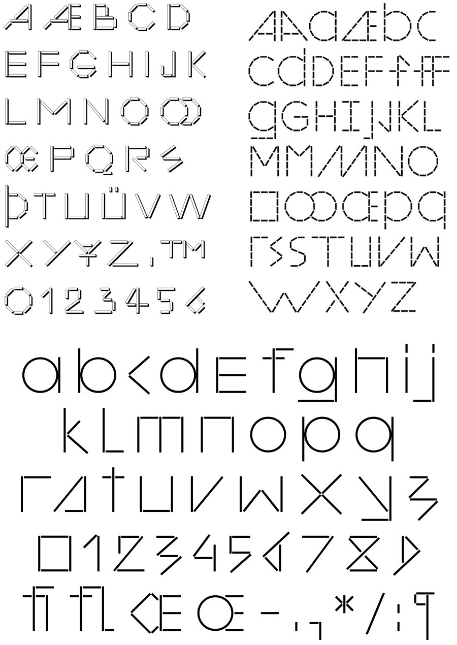
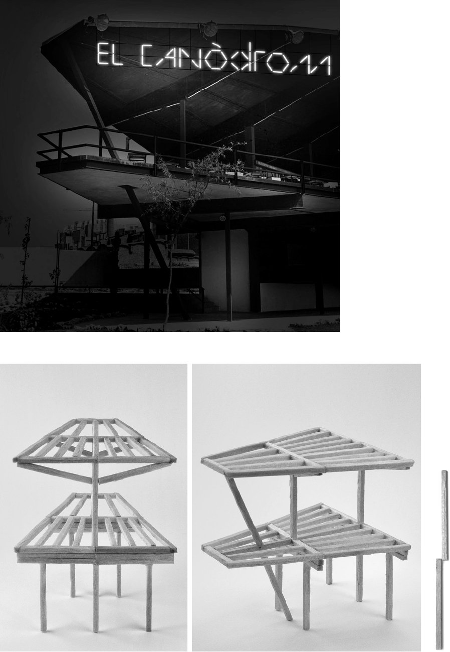
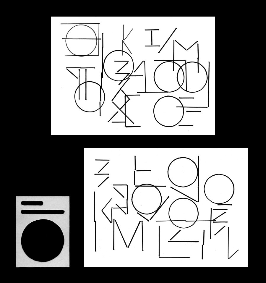
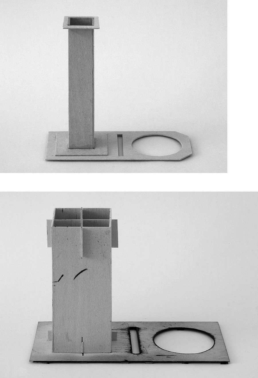
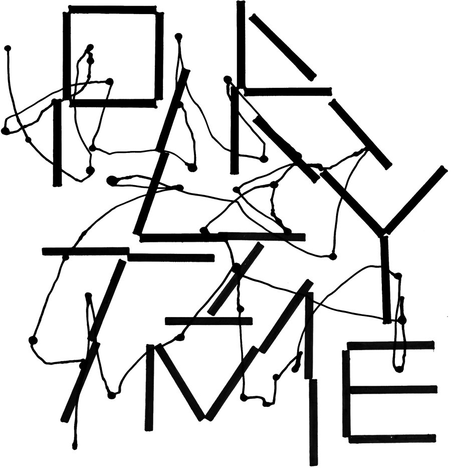
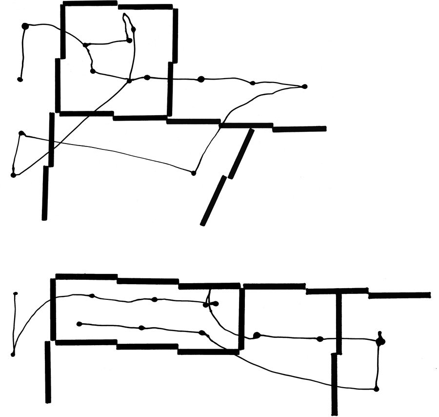
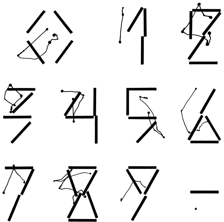
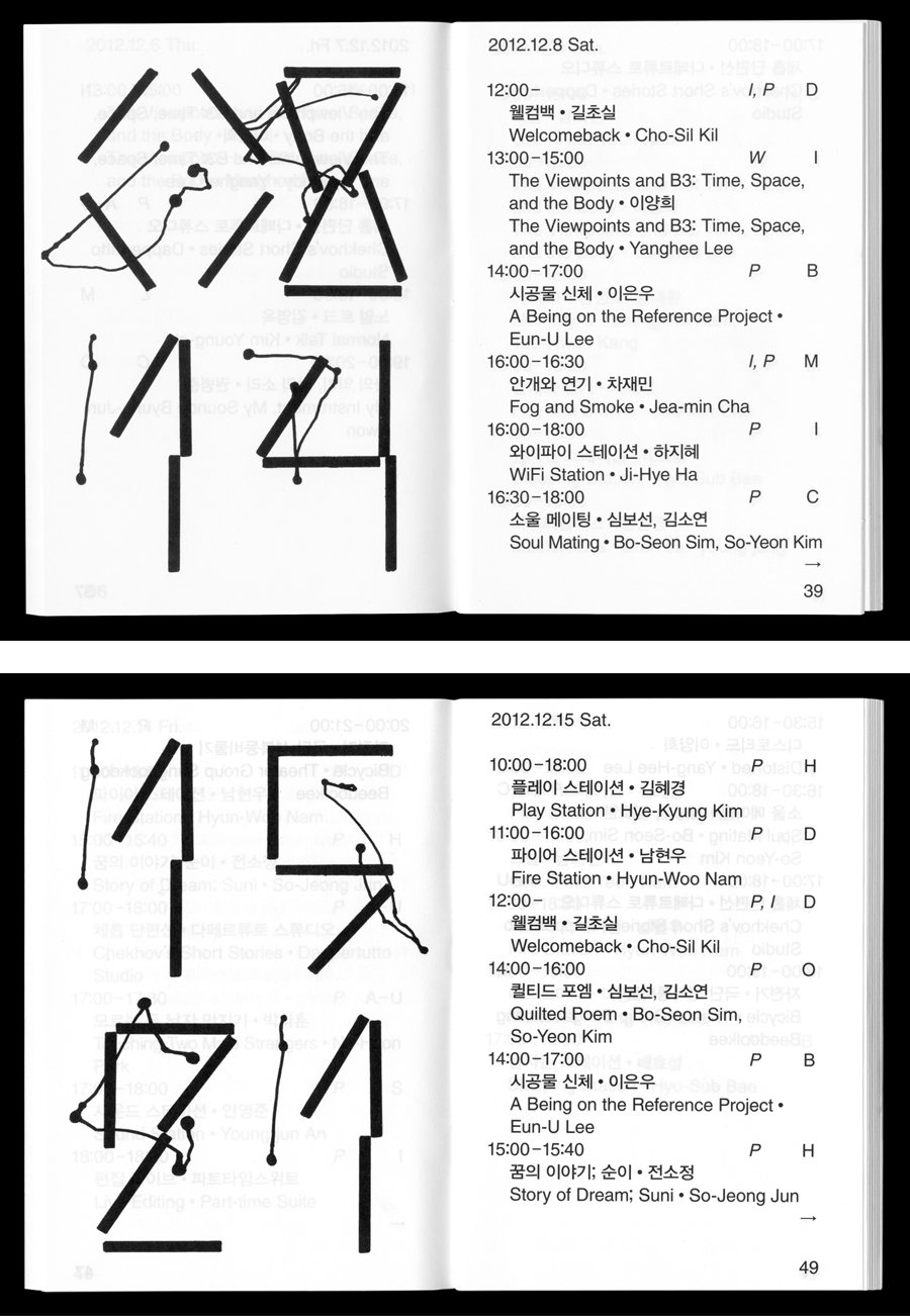
In 2010, a second commission from M&VD proposed to expand this principle into an extensive graphic identity, for a new art centre to be located in the iconic Canódrom building in Barcelona. [5] Four fonts were initially produced, using a hand-made drawing template to combine different scales and multiples of the circle and line modules, but the entire Canódrom project was abandoned before they could be implemented. [6 7 8 9] Versions of these early Unit fonts appeared in various exhibitions, graphic identities, and publications over the next four years, and the drawing templates that produced them took on a life of their own during this period. [10 11 12 13] One included an attachment that draws a line following the movements of the template during the construction of its letter sequences, a meta-drawing that exposes the improvised performance behind these apparently rational forms. [14 15 16 17 18]
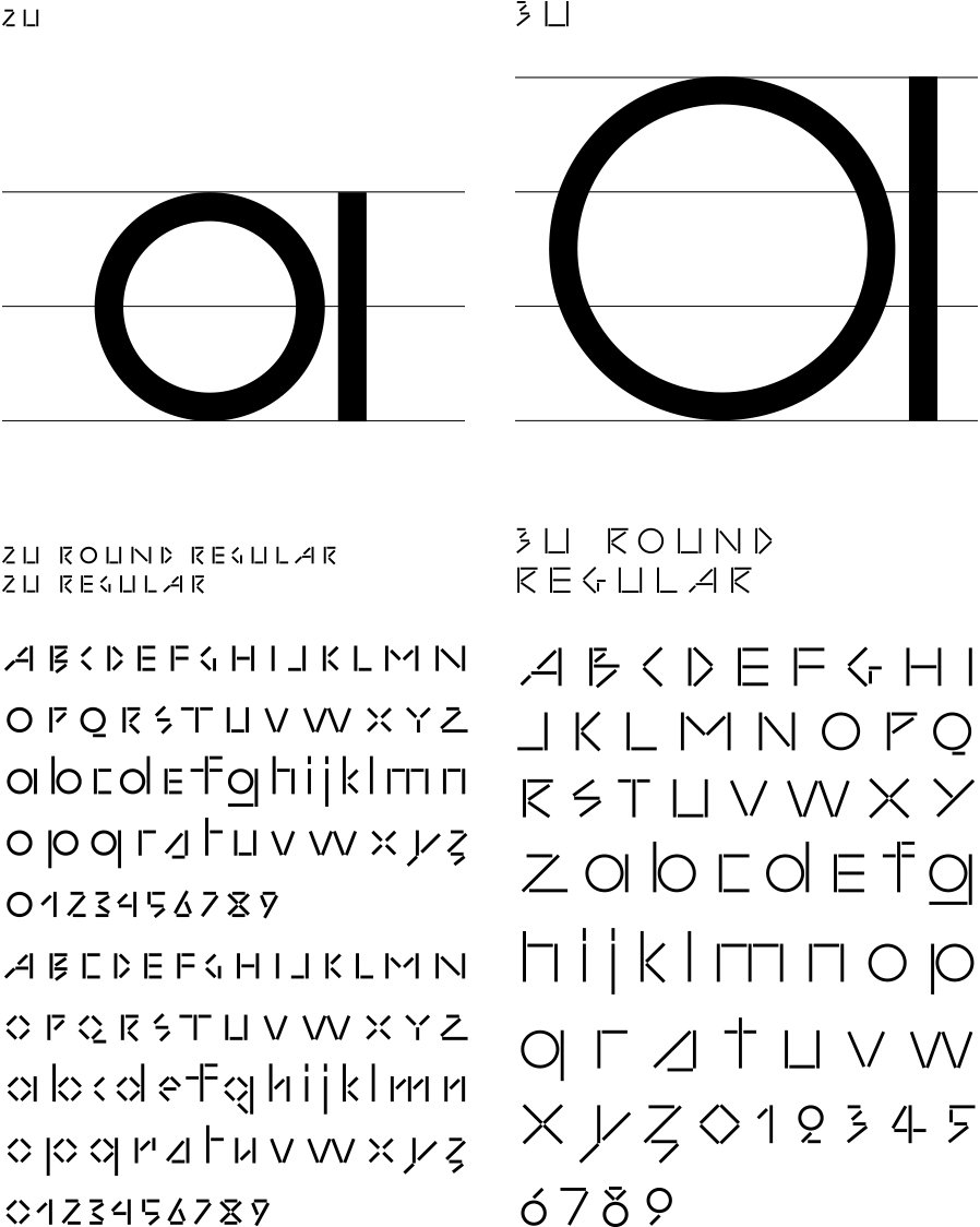
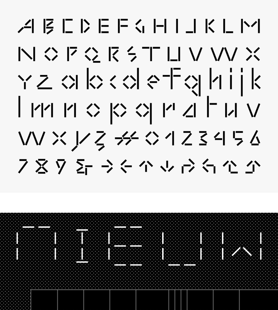
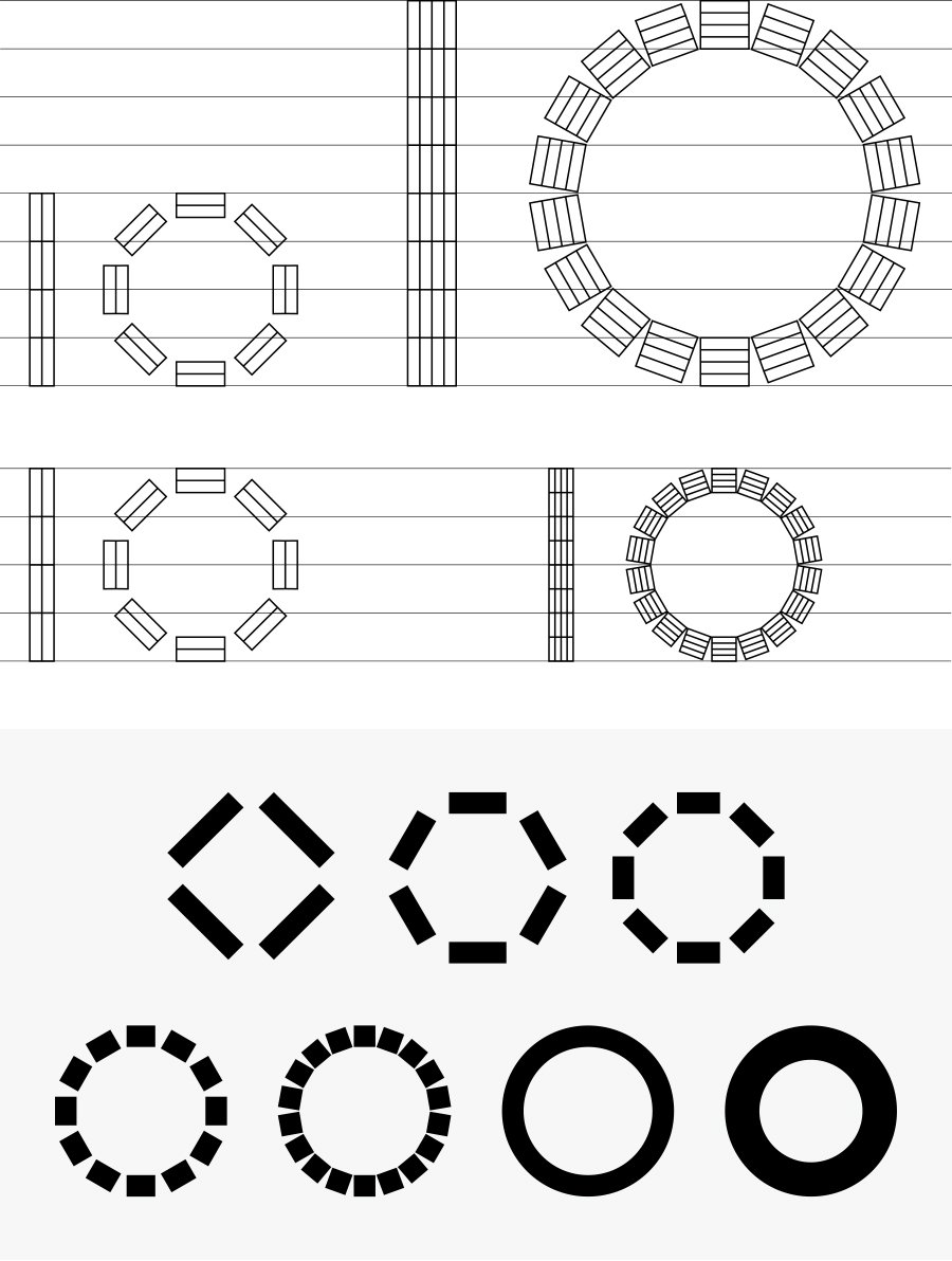
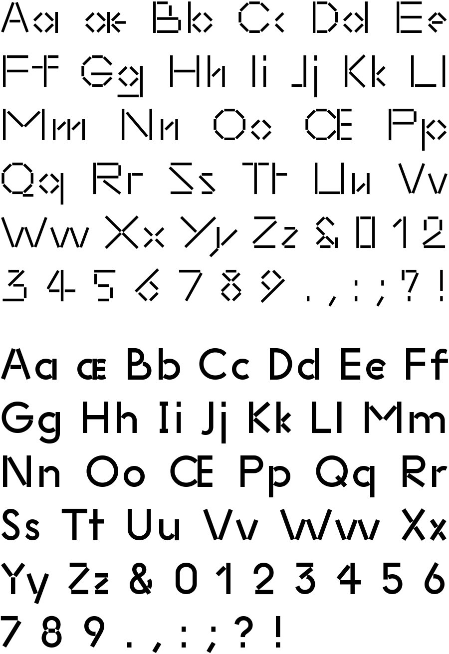
In 2014, a third commission from M&VD provided the opportunity to fully elaborate these experiments, as a central element of their new graphic identity for the Museum of Contemporary Art Chicago.¹ An extensive scheme of fonts, now named MCA U, was drawn, organised by the basic number of units in their construction. [19] The scheme starts with the 2U font, whose curves are crudely described with two perpendicular lines. A single linear unit is added to each successive style, ultimately arriving at the 10U font, whose modules are connected to form a perfect circle. [20] Nine styles were prepared for the introduction of the graphic identity in 2015, and a further three were added in 2017.
¹https://mcachicago.org