
The Marq typeface was originally drawn in 2007, intended to appear on the covers of a series of 12" records released by the label En/Of (DE), but ultimately never used for that purpose.
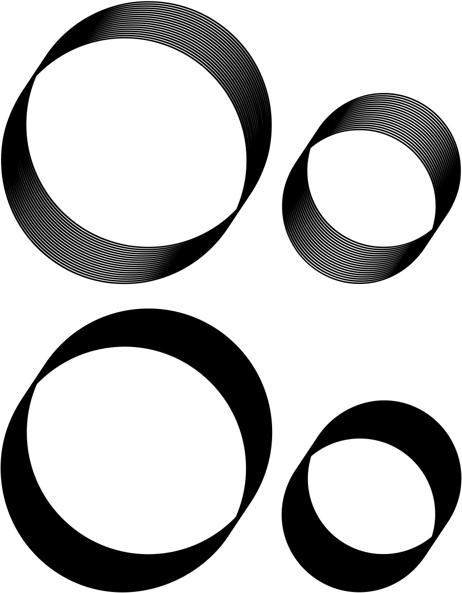
Its forms derive from experiments with the marker pen, whose thick, angular, strokes are often used to write track names, by hand, on duplicated CDs and ‘white label’ vinyls. When a marker’s ink supply is almost exhausted, its heavy line splits into skeletal paths, all locked into the same parallel motion. [1] Marq renders this fleeting effect in precise, digital perpetuity.
Marq is available in two styles: the original; and a later variation in which the spaces between the paths are filled, creating an anachronistic reanimation of the typeface Century Gothic, on whose simple geometry the original Marq’s glyphs are based. [2]
Related Work
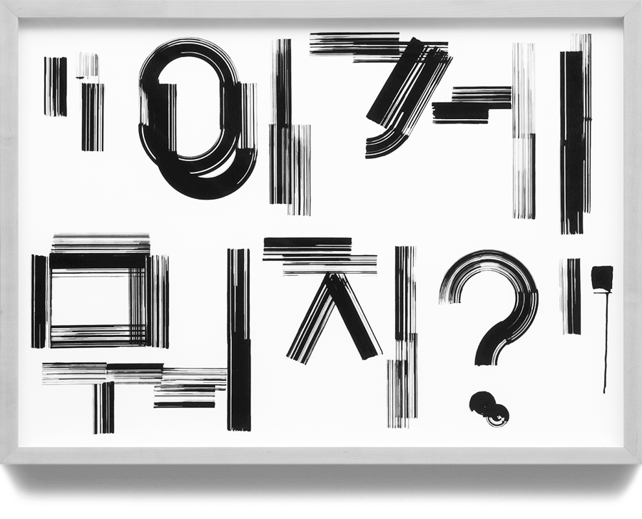
Two posters designed for Korean artist Sasa [44], presented at the exhibition No Mountain High Enough (Audio Visual Pavilion, Seoul, KR, November 28, 2013 – January 25, 2014). [3 4] Additional files (PDF): Book / Test Tracing.