Lÿno family. From top to bottom (lowercase and uppercase): Stan, Ulys, Walt and Jean.

Above: Walt Disney Pictures logotype, 1990 – 2006. Below: Paul Renner's first designs for Futura, 1924.

Lÿno Walt, digital sketches. Above: June 2009. Below: September 2009.

Lÿno Walt. Above: ligatures, digital sketch, November 2009. Below: final design, 2011.


Above: drawing template, cardboard, ink on paper, 2008. Below: Lÿno Jean, early digital sketch (before working from collages), 2009.

Above: dishwasher tablet packaging, punch-cutting and cut-outs, cardboard, paper, 2009. Below: letter ‘M’, model, painted cardboard, 2009.

Lÿno Jean, sketches of uppercase (selection), cardboard, paper, 2009.

Lÿno Jean, uppercase (selection). Above: digital sketch based on collages, 2009. [7] Below: final design, 2010.

Lÿno Jean. Above: sketch, cardboard, ink and final design of the number ‘8’, 2009. Below: sketch, pen on paper and final design of ampersand glyph, 2009. 


Lÿno/Lÿon Jean as presented page 17 of the specimen Newer Alphabets (a supplement to the Korean magazine GRAPHIC #16 ‘Type Archive Issue’), 2010.

Lÿno Jean, sketches of alternate uppercase (selection), ink on paper, tape, 2011.


Lÿno Jean. Above: first draft of alternate uppercase and ligatures, 2011. Below: final design of alternate uppercase, ligatures and interfinity mark, 2011.

Lÿno Jean as presented on page 17 of the specimen Newer Alphabets (second edition), 2012. 

Jean, Skeleton, sketches, cardboard, 2011.

Jean, Skeleton, final design, plastic, 2012. An enlarged version (170 cm height) was shown during the exhibition Life a User’s Manual and accompanied with a text by David Bennewith, 2012. [16]

David Bennewith, Without Skeleton, No Dinosaur. Ghost Making. Published in the exhibition catalog of Life a User’s Manual (pp. 52 – 54), KCDF, Seoul, KR, 2012.

It was the first time I saw the material used to construct the forms of Karl Nawrot’s typeface Jean that I became curious. A series of abstract shapes, cut-out of an ‘Albert Heijn’ brand cardboard package [that once held dishwashing machine tablets], was being projected in a presentation of Karl and Radim Peško’s Lÿno typefaces in a gallery space in East Amsterdam. Both the shapes themselves and their negative referent glowed onto the wall, a self-contained loop, a transformed whole. That they were presented as base-material to be used to make letters reminded me that designed letters themselves are usually imagined and constructed from a skeleton – a basic structure (of an equal stroke) that we learn to recognise as the letter itself. This recognition that comes from repetitive seeing and doing, the skeleton is also the thing that remains. This is the same skeleton which most type-designers refer and then add to, decorate; flesh out; embellish – to make a new version of our alphabet. These cardboard forms I was looking at didn’t really suggest this basic structure – this skeleton – at all. It would be through these forms arrangement that they would eventually become ‘letter-like’. Brought back to resemble that familiar idea, but approached, this time, from reverse. That this set of blobby shapes and off-cuts could produce an alphabet was achieved by a puzzling of its non-fluent strokes.

It is not unusual that an artists handwriting or visual language will wind-up in a typeface; it lends the typeface an ‘atmosphere’ [something else that doesn’t have a skeleton]. This is the case with Jean, whose forms are influenced by the French/German Artist Hans [Jean] Arp. These blobby forms clearly relate to a formal/visual motif expressed in Arp’s work. But, cut out of that used box of dishwashing tablets we perhaps see a deeper consideration: An association to Arp’s conceptual practice. Of collage, of Dada, of abstraction, of poetry and Pop. Jean appropriates, or perhaps extracts, a not mutually exclusive form & meaning from what might otherwise be considered rubbish. Creating a possibility for discernible but uncanny letters, Simultaneously free and restricted – highlighting a tacit tension inherent in most type-designs. This ghost-holon-artifact [Nawrot’s ‘Ghost in the Machine’?] reminds me of what is in-between (a place I like), it manages to stay incongruous, autonomous. But as a digital contrivance, waiting to be activated, is stays warily connected to the whole, haunting the others.

These things tell me it might not only be the border of the letter that is important, but also what lies inside its dark silhouette and the material with which it is made – the silhouette which the philosopher Roland Barthes described as both an anatomic and semantic object – which, in this case, is certainly not a skeleton, but a phantom... Here, it is the air that now forms its background, distinguishing itself in place and time.

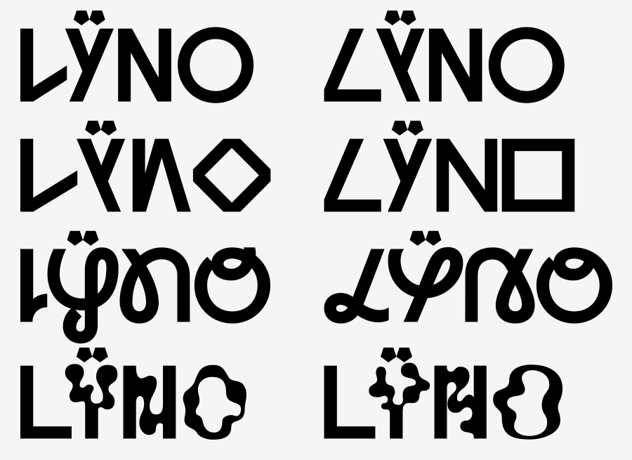
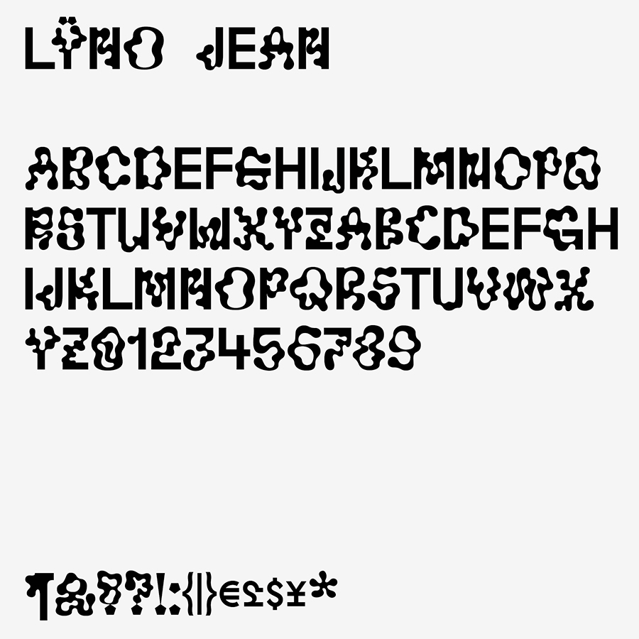
Lÿno¹ is a family of four genetically edited children, sharing a common weight of line, conceived and designed with Radim Peško between 2009 and 2012. The names of the individual fonts were not premeditated, but chosen to reflect and relate the characters of the four siblings: Stan (after Stanley Kubrick), Ulys (after Ulysses 31, a French-Japanese cartoon), Walt (after Walt Disney), and Jean (after Jean Arp). Walt and Jean were primarily drawn by Nawrot; Stan and Ulys by Peško. [1]

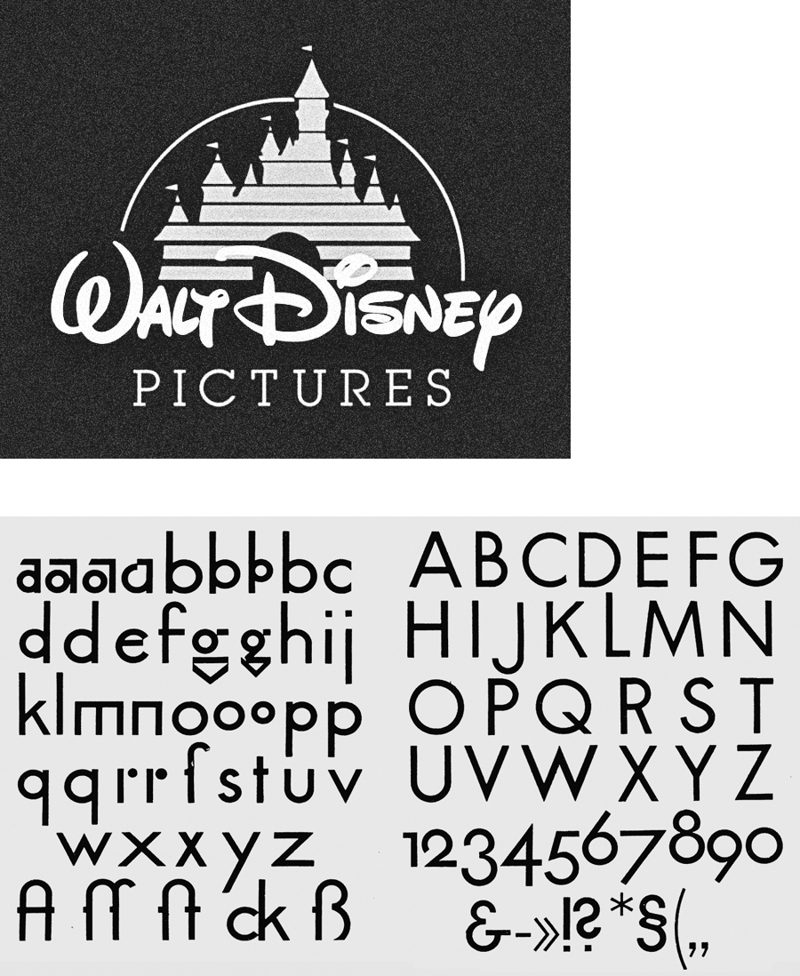
Drawings for Walt began with the intention of mixing two contradictory typographic genealogies, represented by the existing faces Waltograph,² derived from the Walt Disney Company logo; and Futura, the canonical early twentieth-century geometrical sans-serif. [2] The mixture takes the flowing, hand-lettered upper- and lower-case strokes of Waltograph and re-routes them through the rationalised vectors of Futura. [3 4]

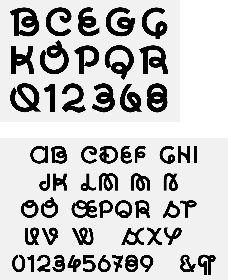
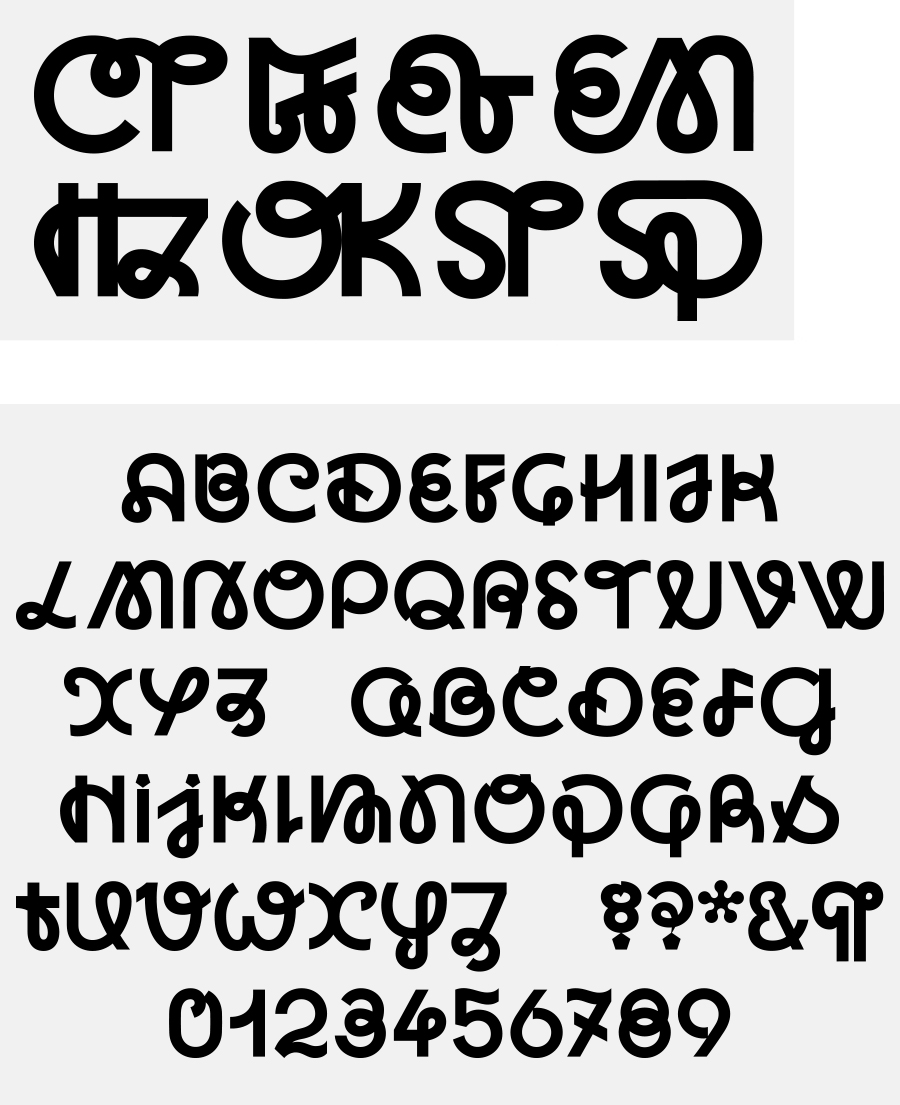
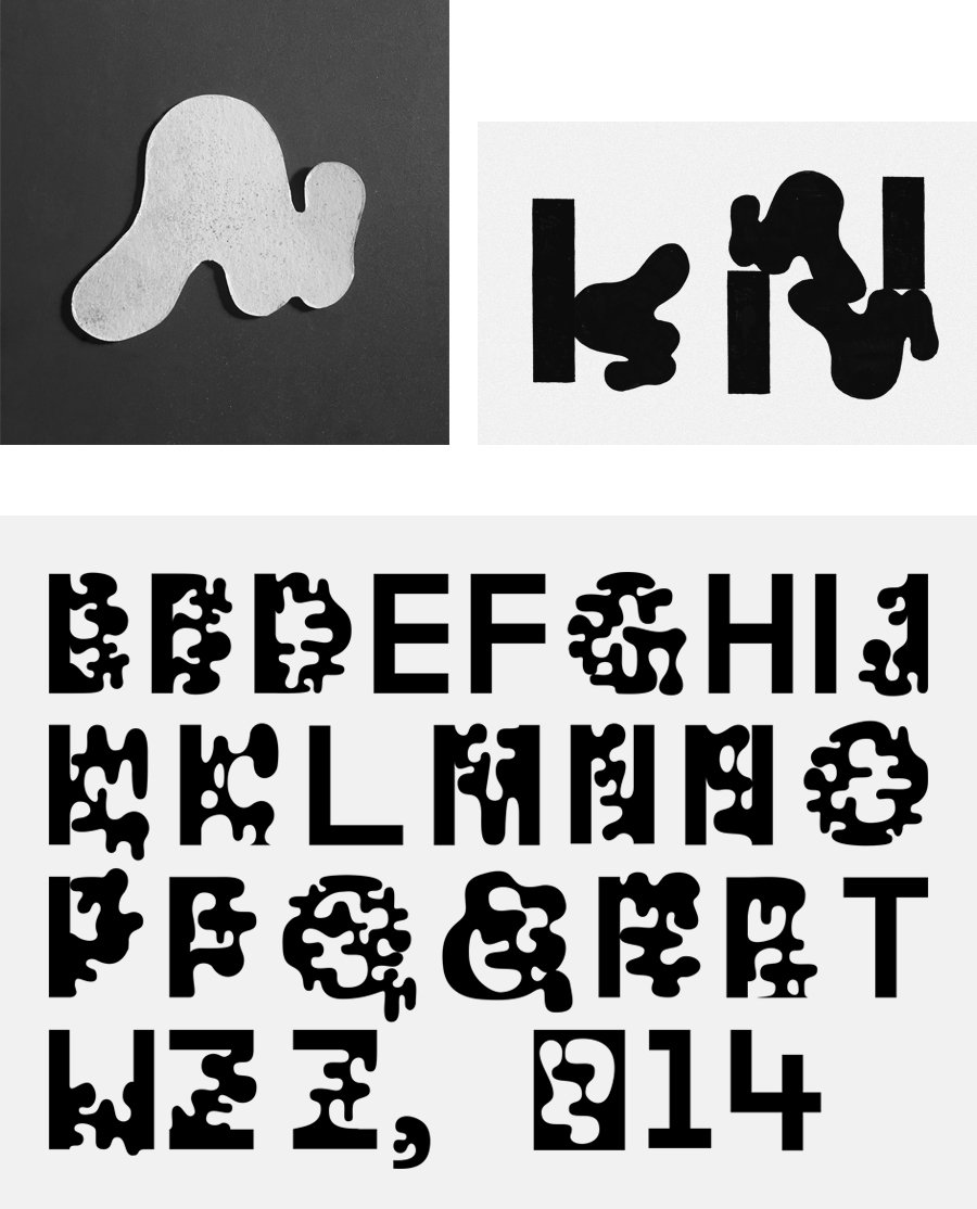
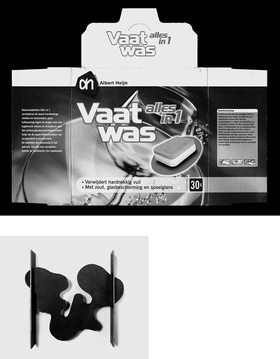
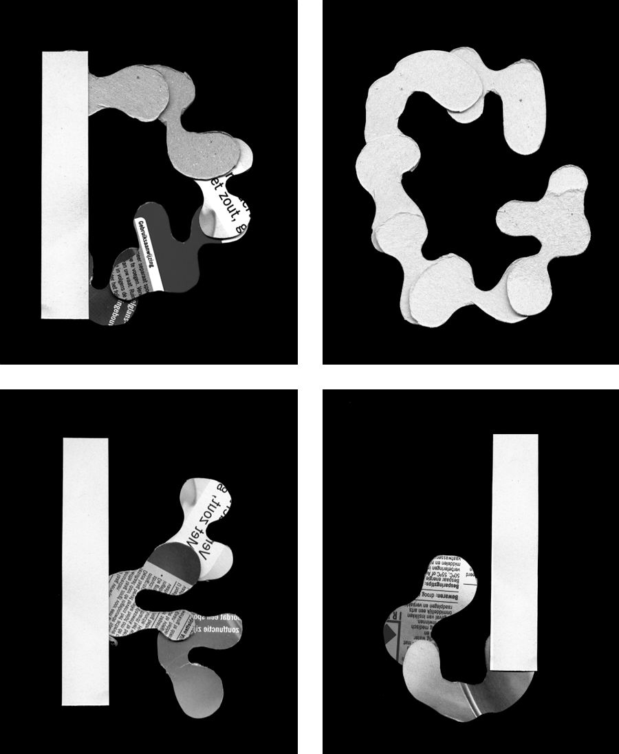
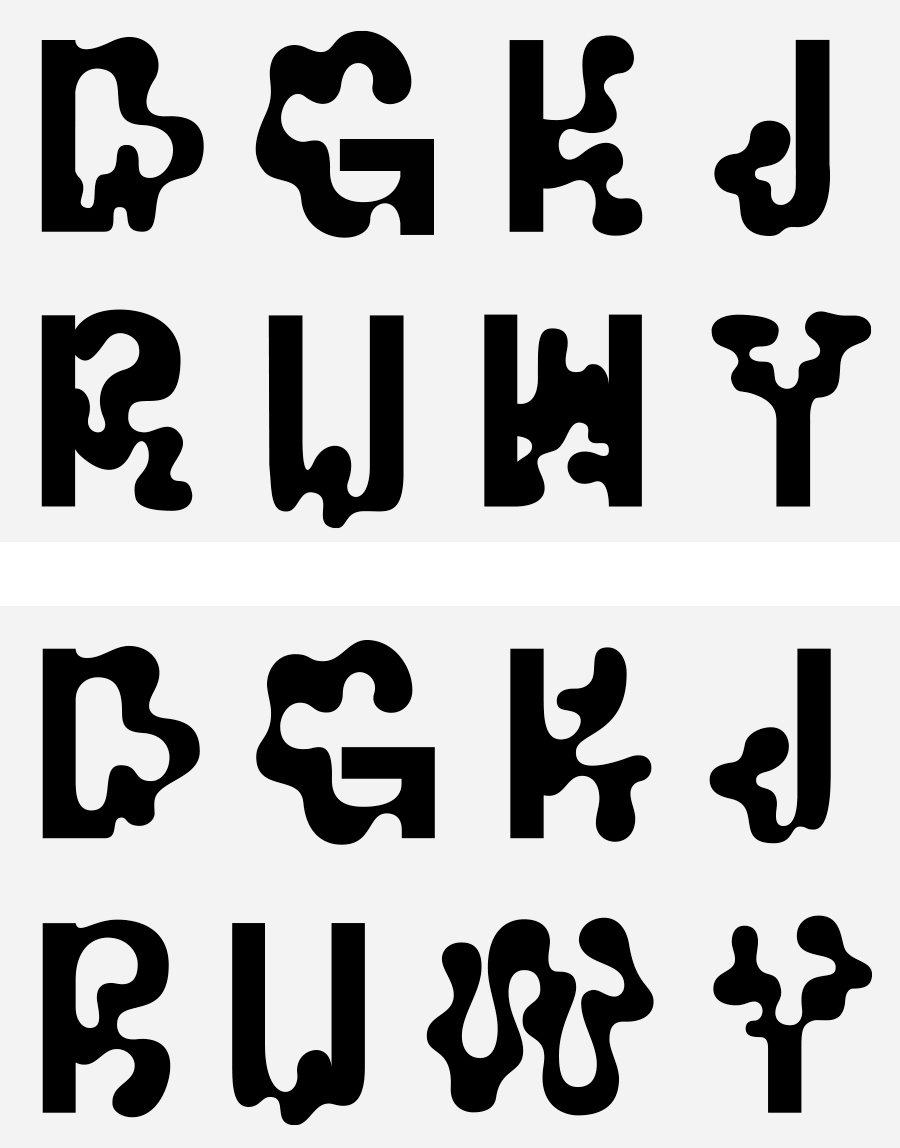
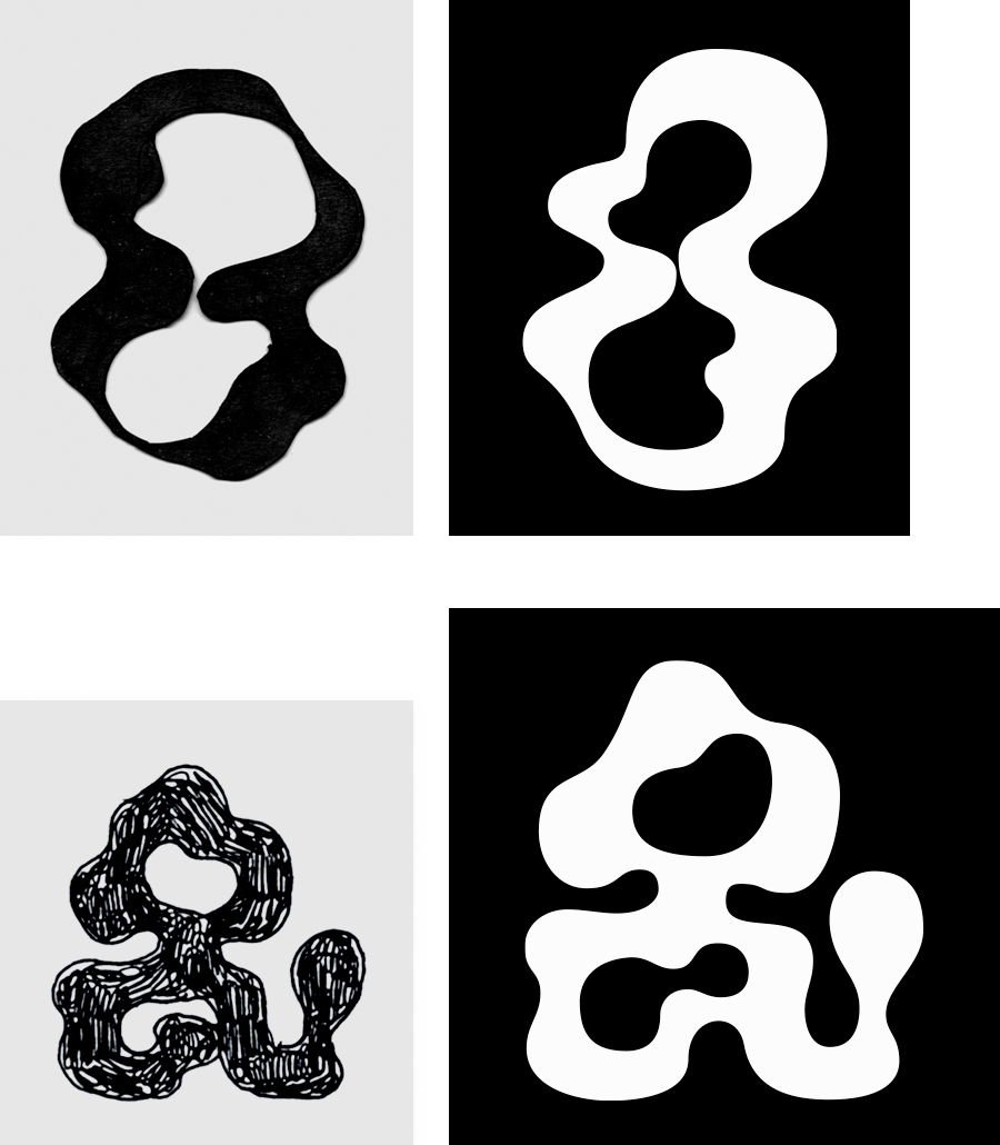
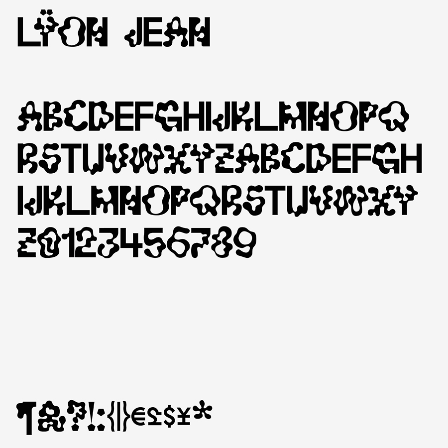
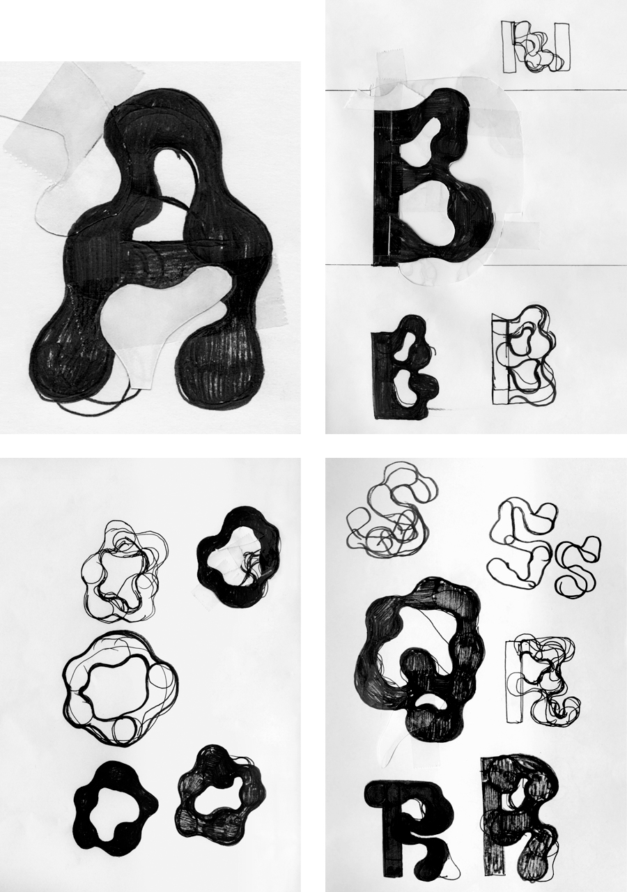
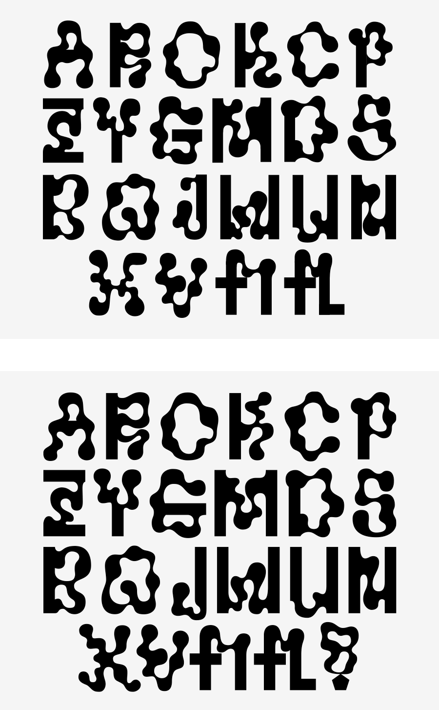
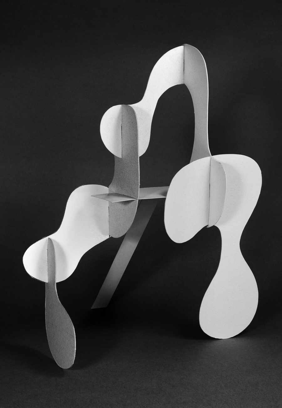
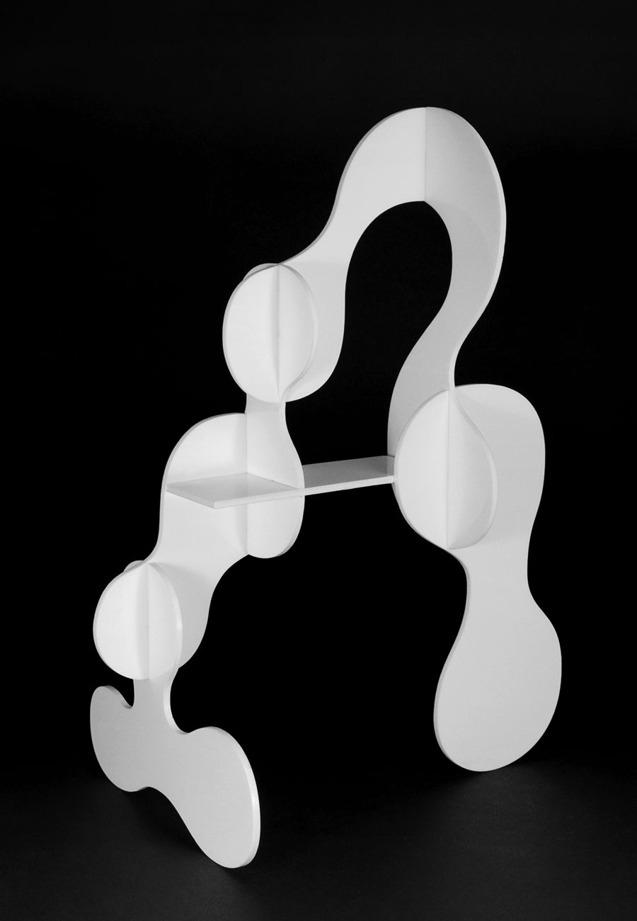
Mixture is also the impulse that produced Jean, although its genetics are far more elementary. Maintaining the basic alphabet’s vertical and horizontal strokes (in reference to Wim Crouwel’s over-rationalised New Alphabet),³ Jean transforms its curves and diagonals into unruly blobs with no concern for any conventional economy of line. [5] These forms are the outcome of a labour-intensive process, alternating between cardboard collage and digital manipulation. [6 7 8 9 10 11 12 13]


¹Between 2009 and 2012 Lÿno was named Lÿon.
²https://en.wikipedia.org/wiki/Waltograph
³https://www.moma.org/collection/works/139322


List of Exhibitions Related to Lÿno
*Latent Stare*, Casco – Office for Art, Design and Theory, Utrecht, NL, July 8 – September 30, 2012.
Life a User’s Manual, Culture Station Seoul 284, Seoul, KR, September 14 – November 4, 2012. [14 15 16]
Neue Schriften. New Typefaces, Gutenberg Museum, Mainz, DE, June 7 – October 27, 2013.
All Possible Futures, SOMArts, San Francisco, US, January 14 – February 13, 2014.
Viral, Le Signe – Centre national du graphisme, Chaumont, FR, May 27 – November 21, 2021.

Lÿno © 2009 – 2023 KN & RP. All rights reserved.